
This post will mainly focus on making a website mobile friendly. Nowadays, with the increased usage of mobile devices and the rise of the internet it is becoming more and more important to create websites which include a mobile friendly version. When you have a site with a lot of visual content, you need to consider a layout for mobiles and tablet versions. The post will suggest a few methods based on the media query.
Responsive Design & Development
When building a website developers usually include stylesheets in the head section of HTML which looks similar to the following:
<link rel="stylesheet" href="main.css" media="screen" />
When printing website content you won’t necessarily need background images, pictures and extra funky stuff visible but just pure information like text. In order to achieve this, developers will use the below code:
<link rel="stylesheet" href="css/print.css" media="print">
The media attribute allows you to define what is viewable on a specific device screen. Using this information you can control the layout depending on the screen width of the device. Using this information you can force browsers to display the content in a way defined at the beginning.
Above we use the conditions:
Media=”print” which in the human language it says “when the device is printing include the print.css file”
Responsive web development and design
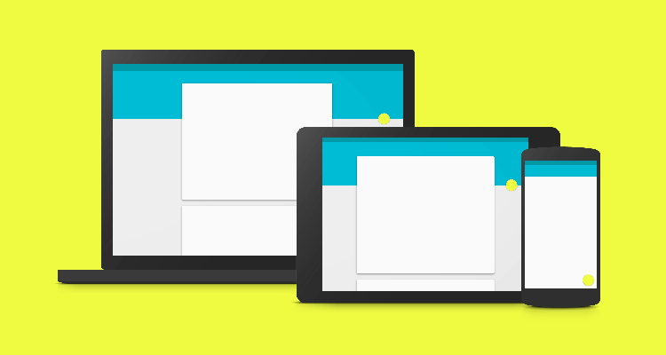
This technique is called responsive web design (RWD) or responsive design development: it is an approach to web page creation that makes use of flexible layouts, flexible images and cascading style sheet media queries. The goal of responsive design is to build web pages that detect the visitor’s screen size, orientation and change the layout accordingly.
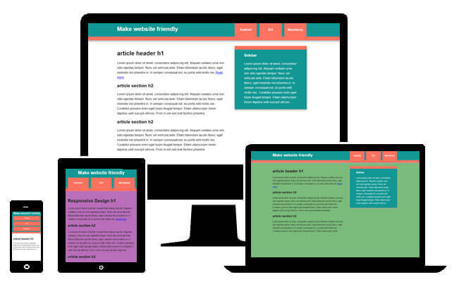
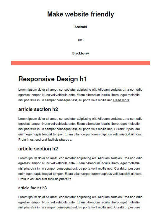
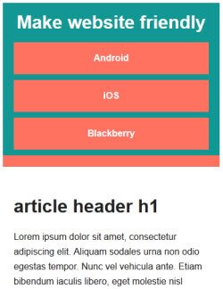
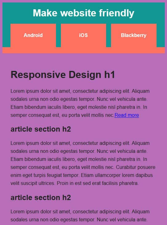
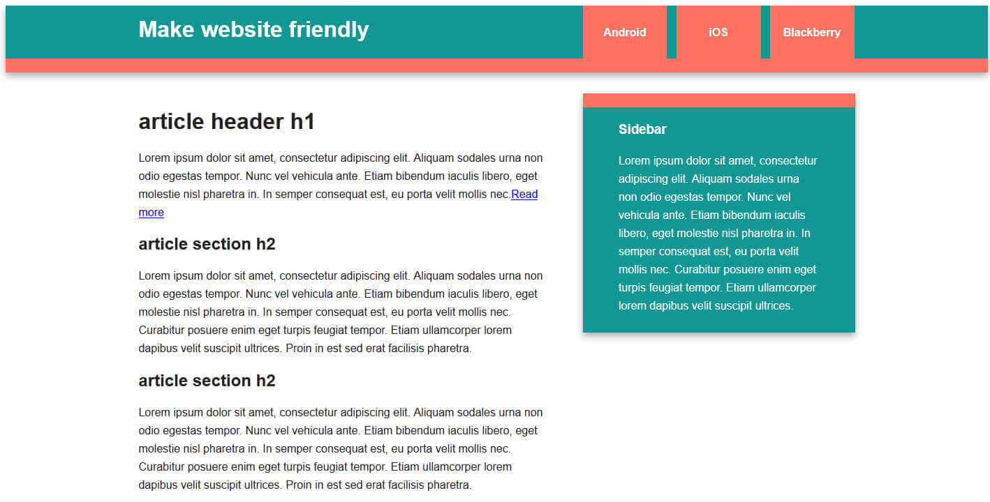
In the example below we will create a website that contains two columns (content and sidebar areas) for desktop and landscape tablet screens that allow enough space, and 1 column for narrow smartphones and portrait position on tablets.
Therefore in the main.css you will find that we define three different media queries. This will trigger the specific screen sizes 480px, 768px and 1140px.
All media queries in one file
Using media queries help us to create a single css file which triggers all conditions for different devices. This simple example will demonstrate this:
@media only screen and (min-width: 1140px) {
body { background: #7ABA7A; }
/* ===============
Maximal Width
=============== */
.wrapper {
width: 1026px; /* 1140px – 10% for margins */
margin: 0 auto;
}
}
Download template
Useful Resources:
- http://www.catswhocode.com/blog/10-useful-code-snippets-to-develop-iphone-friendly-websites
- http://caniuse.com/#feat=css-mediaqueries
- http://coding.smashingmagazine.com/2011/01/12/guidelines-for-responsive-web-design
- http://mattkersley.com/responsive/